The Story of a Book Cover Design
Jun 23, 2021Book cover design process
Shay came to me after listening to a webinar I gave on the three mistakes to avoid with your book cover. We had already worked together on an issue of iola bookazine. She had written her book and was self-publishing it. She knew what she wanted for the book cover and had started to design one in Canva. But she had gotten stuck. She thought, why don't I just get Abi to do it for me?
We met over Zoom for a consultation call, where I asked her lots of questions about the book, about her inspiration, covers she loved, the genre her book was in, other books in her genre and more. She sent me her Pinterest board of cover inspiration and her cover attempt in Canva.
I sent her two book cover concepts, one drawing upon elements from other covers and images that related to her inspiration board and our call and one which was an extension of the cover she had started to create.
Image choice
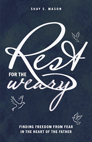
The images that came to mind when Shay thought about rest were; the heart of the Father, water, beach, budding flowers, cool colours, birds openess, nature and trees. Colours she associated with the message of her book were, blues and greens, and watercolour. Book covers that were on her Pinterest board were highly illustrative, with a lot of painterly effects, a lot of blue, and typography treatments that interacted with the imagery.
The promise of the book for the reader
The reader of the book is a woman who struggles with fear and anxiety. She is frustrated and has read many Christian books, she feels trapped in a small dark box and wants out. The promise of the book for the reader upon reading Shay's book was to step into greater freedom, opening their heart to what Father God has for them.
Designing the cover
(Geeky part warning) I used vector and graphic design elements from Envato elements and Creative Market and edited them within Illustrator and Photoshop. I built the initial design backgrounds within Photoshop and then created the final concepts and artwork files within Indesign. When outputting the pdf from Indesign you have more control over the settings for print, such as bleed (the amount of an image that needs to bleed over the edge of your page so that it trims without white lines) and the text treatments within Indesign are more flexible.
Creating the concepts
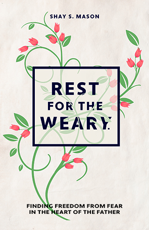
She loved one concept and I tweaked it a little to Shay's approval. The concept chosen uses elements of growth and freedom represented by the vine growing through the box. I wanted to emphasis the 'weary' with the leaning 'y' and elements of the vine supporting the text. The budding flowers were added and used as a highlight peach/pink colour to add contrast.
Changes made
Can you see I straightened the Y, removed the full stop (period) and brought some of the letters forward more from the vine leaves?
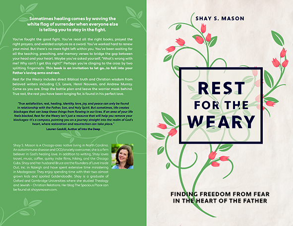
For the back cover I took vine elements and used them to link the two covers together. Shay's book interior designer added the spine, logos and barcode as he was uploading the files to Ingram Spark.
Shay was happy and Rest for the Weary is now available!
She used an editable bookmark and social media templates I made for her in Canva in the book launch.

Shay says: "I couldn’t be happier with the book cover Abi designed. She took my ideas to heart and perfectly captured my vision as well as the feel of the book...and she did it with the first design! I have had many comments from people who picked up my book because they were captivated by the beautiful design. Abi helped make my dream a reality!”
Do you need a better book cover?
Click here for options that can help you.
