How to design a professional e-book
Oct 13, 2021
You want to design an e-book as a free giveaway on your website, or to sell on Amazon or elsewhere. Whilst the access to making / designing an e-book is low-cost, and available anywhere there is internet, it is not always easy, simple, or straightforward. Here are my top tips for designing a professional e-book even if your design knowledge is at zero!
Software
Let's start here. You can design a simple, short e-book using Canva. I have a free template you can use. (See the bottom of the post) The great thing about e-books is that you don't need to worry about production costs so you can go all out on colour and photos and design. But restraint is key! Adobe Indesign is the industry standard for book design, you can get a subscription for a low-monthly cost. If your e-book is text only you can even use Word for your interior pages but your design elements and output will be limited.
E-books for sale on digital platforms such as Amazon are usually in a PDF, .mobi or .epub file format. You can output these from Indesign, you can output a PDF from Canva.
Page layout
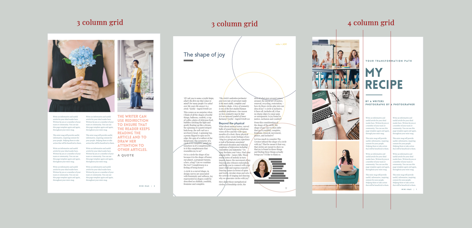
Pages are usually designed on a grid format. This means that if you divide your page into three or two, elements on the page will stay within those boundary lines. It is worth deciding on your page grid before starting to input the text. You can have more than one page layout style but consider how many pages your e-book will be and restrict your page styles. For example don't have seven different page grid styles in an eight page e-book.
Margins
Make sure that you use decent margins on the edge of your pages. I recommend at least 15mm at the sides and bottom. I recommend using page numbers and footers on your pages so you will need to factor in extra space for those too. As it is an e-book you don't need to worry about extra space for the centre margins that you need for a print book. Even if you have different page grid styles, keep the margins the same across the whole book.
In Indesign you can use master pages, to set your margins and columns, headers, footers and page numbers, so that they stay in consistent places across every page. In Canva you'll want to maybe create a 'master-page' with your basic gridor use templates and then duplicate each page to start with.
Headers and footers
For an e-book it is important to have a footer on every page and page numbers. If someone decides to print out a page then your information will be on that page. It is worth including your book title and url so that your work is always credited and readers can refer back to you for further work and resources.
In Indesign you can make an interactive pdf where you can create hyper-links within the e-book for cross referencing or on a contents page for example. Great for readers navigating their way around your e-book. You could also create links in your footer, for readers to access your website in one click.
Call outs
Create interest on your page by using call-outs. You can highlight key sentences or points this way. Create a consistent style for your call out. You can use lines as well as a font style, boxes or shading, or graphic element.
Typography
Fonts
Use headers and create a hierarchy (size, weight difference) for levels of headings. Be consistent with use of brackets, hyphens, bullet point styles etc. For example don't use numbered bullet points in one place and then un-numbered in another. Choose one.
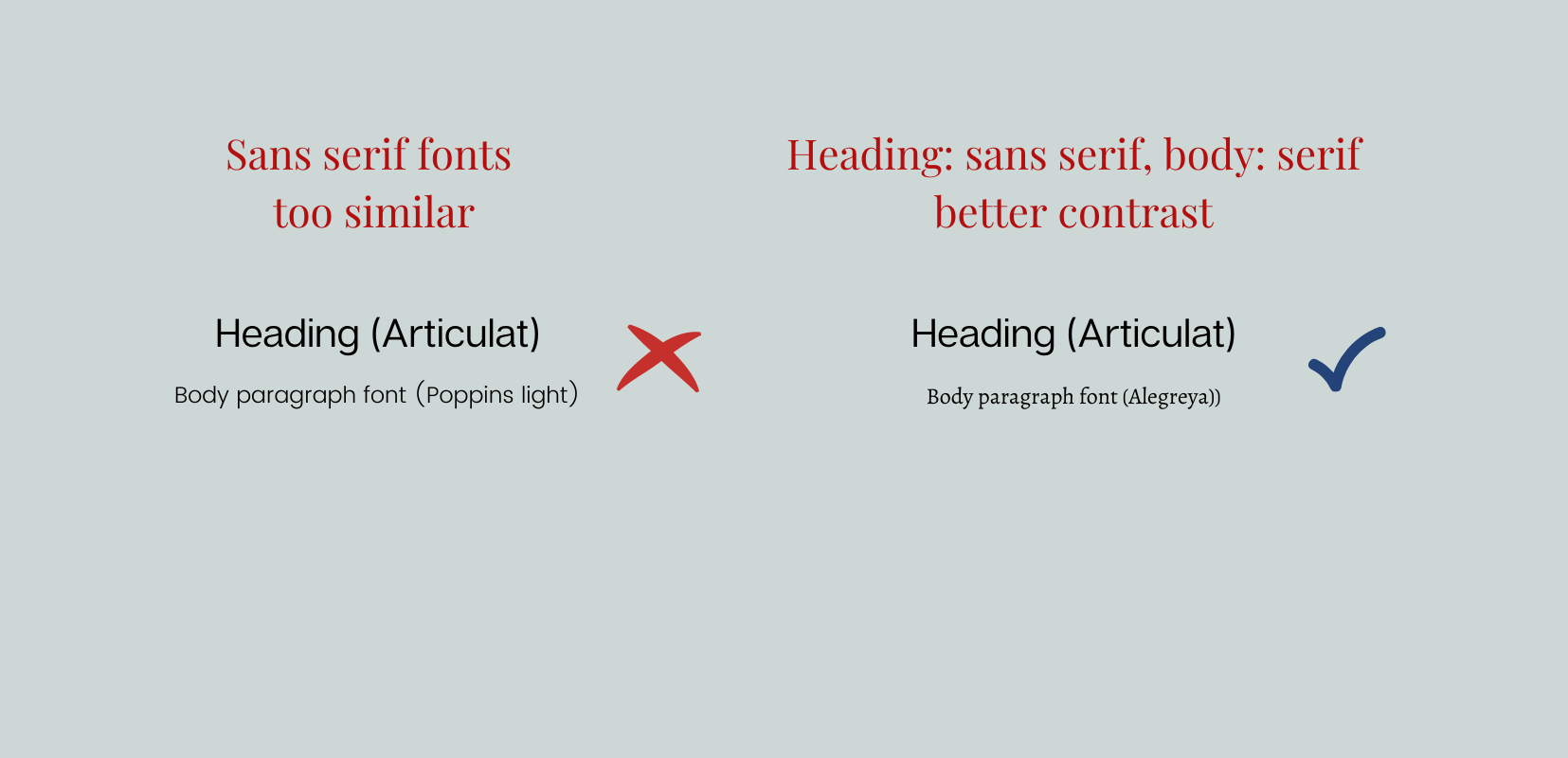
Choose one font for your headers and one for your body text. Generally speaking you want to stick to a Sans-serif font for your headings and a serif font for body text. (Serif fonts are easier on the eyes for reading in paragraphs.) Make sure there is enough contrast between the font styles or consistency! So avoid using two fonts that are too similar. Either use a heading font that is very different in style to your body font or just a larger and heavier weight than your body font.
Spacing
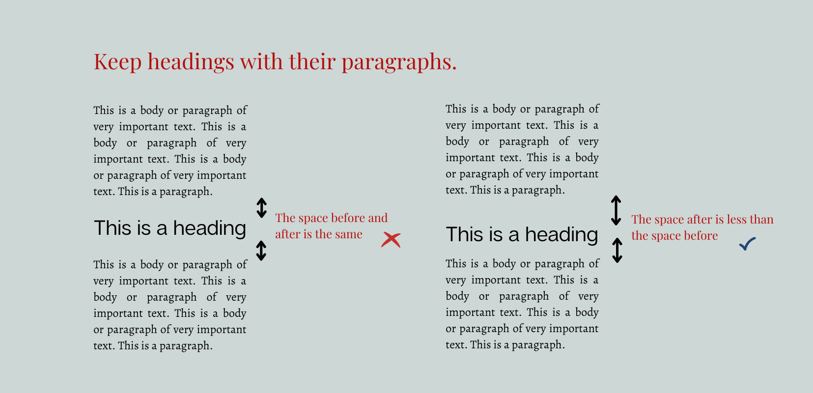
In Indesign you can control the amount of spacing between lines of text. This means you can keep headers closer to the paragraph that comes after, than to the paragraph that comes before. This makes most sense for readers. You can also set the space between paragraphs and if you want, the space between bullet points. This makes the bullet points sit within a paragraph rather than looking like separate paragraphs themselves.
In Canva you can control the line spacing, make sure that it is consistent through out your e-book for your different text styles.
Widows and orphans
In Indesign you can control the tracking of a paragraph to avoid widows and orphans. Widows are single words on their own at the bottom of a paragraph. Orphans are single words that 'go on ahead' to the next column or page. Tracking controls the amount of space there is between words in a paragraph so you can pull words back into the paragraph, so that there are more than one word on a line. Generally speaking you only want to track back to -5 in a paragraph, otherwise the text will look squashed.
Alignment
Again, be consistent. With your headings and paragraphs keeping them left-aligned in an e-book will look professional. If you are using columns of text, you may want to justify the paragraphs (so that the words line up each side of the paragraph) if so, look out for 'white rivers'. If you see 'white rivers' of space running through your paragraphs, you may want to adjust your tracking to tighten up the space which can be distracting for a reader.
White space
White space in your page layout design is good! No one likes reading crowded pages. Keep within your page grid and allow space around elements such as photos or call-outs. White space will make your e-book look luxurious and draw attention to the things that need to be seen in the right order.
Images
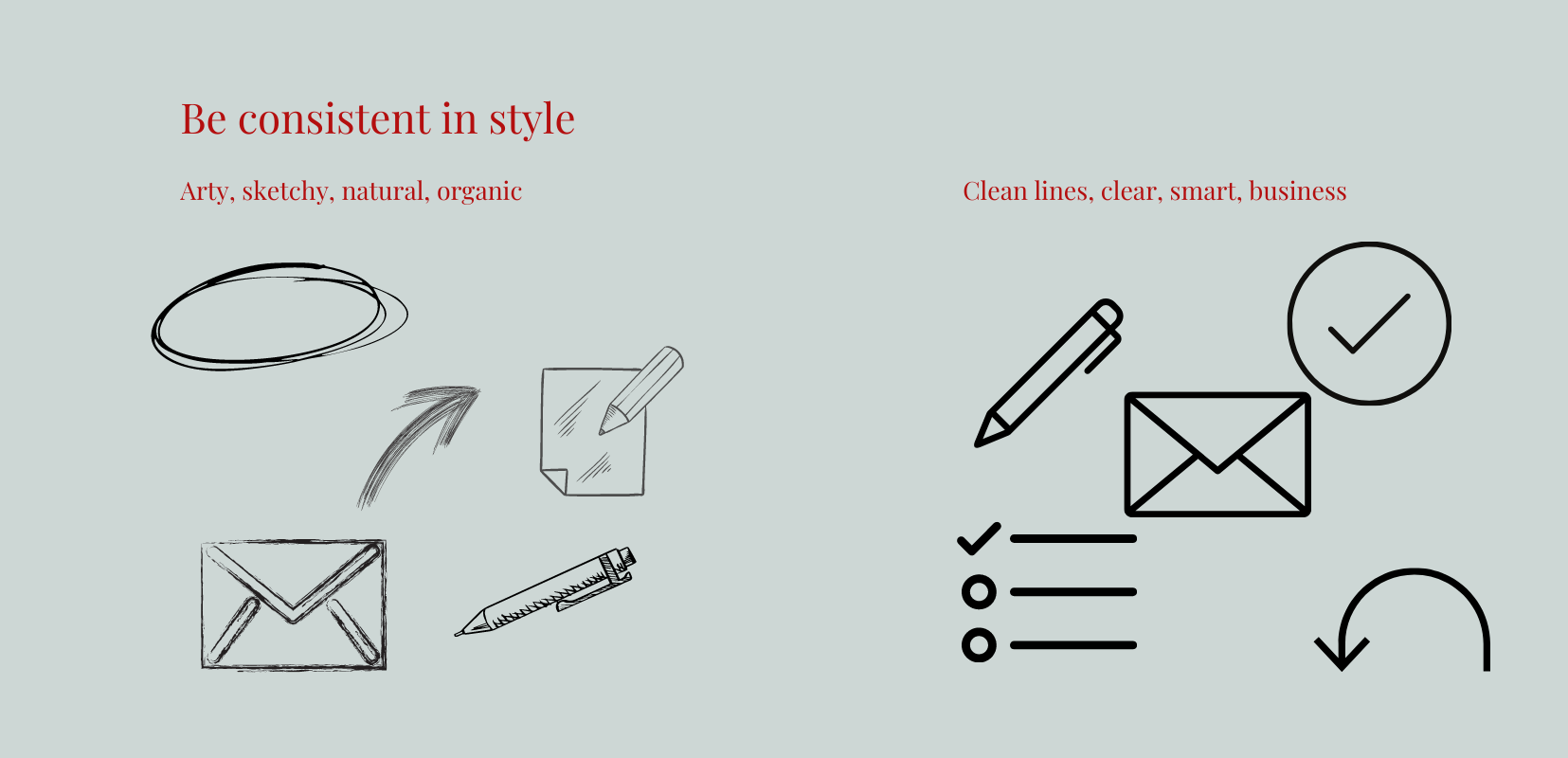
Use photos that inspire and reinforce the message of your e-book. Or use icons and graphics. This adds visual interest and demonstrates your message in action. Pick a colour palette and try to use images that sit within the palette and theme of your e-book. In Canva some of the graphic elements can be changed in colour to fit in your palette. Be consistent in style throughout your e-book. That could mean sticking to photos only as visual elements or sticking to graphic/drawn elements only. Try and keep the style consistent.
Call-to-action
Make sure that your e-book has at least one call-to-action, even if it's at the end of your book. How can the reader take their next step? Is it to take your course, is it to implement steps you've shared. This is a great way to help them further and share further resources, services or products with them.
In Summary
Design is really important when it comes to your e-book. It makes your information more accessible to a reader and gives an important and professional feel to your e-book. A reader will take your e-book more seriously if your design is thoughtful and considered and helps them to implement and access your messaging.
If you are ready to create a free e-book, I have a free mini-mag template you can use in Canva to create your e-book. Get yours here.

Pin for later


